In the beginning of 2016, Versatech was facing an identity problem. We didn’t have a functional website, our marketing materials weren’t professional, and we had trouble distinguishing ourselves from our sister companies. We didn’t even have a tagline.
We did, however, have an exciting opportunity to build this brand with so much potential from the ground up.
We felt that it was important to have two goals; one looking inward at our team, and another looking outward towards our target audience.
We started with two things; improving our company culture (internal), and creating a website (external).
When it came to the company culture, we implemented a new incentives program and a newsletter that could keep everyone up to date. It’s also become the most convenient way to make new announcements, recognize outstanding employees publicly, and educate the team about training opportunities or events. But this blog focuses on our B2B website build.

How we built our B2B website
Content: Filling in missing pieces
Our first step here was working with a marketing strategist, who analyzed our current website and found;
- Broken links
- Missing information
- Empty pages
- Poor SEO (ie. None)
- Complicated site navigation
- Underutilized space
- Overstuffed space (too many words on the page, or in large paragraphs no one will ever read)
The first thing she had us do was throw up a landing page for our URL so potential clients didn’t see an unfinished website and bounce. The landing page had contact information and a short explanation of why our website was “in-progress.” We then used the back-end of the site as our content playground, testing navigation structure and content.
Our marketing strategist was able to use her knowledge of information architecture to create a more streamlined menu for us. For example, we had two contact pages with different information that had to be combined. A few other pages were merged for a cleaner menu, and some pages were split apart for strategic reasons.
For example, we had to break down our extensive services list and rewrite it for our two main target audiences; vendors and resellers. Previously, it was a bullet list of terms that our audience may not even understand, since there’s no industry standard for them. We split it into three parts; a landing page for services, why vendors should work with us, and what we can do for resellers.
After the content was done, it had to be put somewhere. We all agreed what we had wasn’t going to cut it.
Development: Hiring a specialist
Building a website we were happy with (and more importantly, our marketing strategist was happy with) was a hard struggle even with a team of programmers. Initially they built a site on Joomla, which seems to be the popular choice in the Philippines. However, we wanted something a little more user-friendly, so we made a switch to WordPress.
Initially our programming team said that this couldn’t be done, but thank goodness for people who know better (I don’t know about IT, so I would have taken this as a dead end).
We hired a freelance developer and WordPress specialist from Canada to help out.
My advice to you on building a website is to get an expert, even if it costs more. In the long run, it will be cheaper than having multiple people work on it because you keep finding mistakes that could have been avoided with a solid foundation.
At first, we had our overworked in-house graphic designer try to coordinate with the programming team to build a WordPress website, and neither parties knew much about it. It would have been a waste of their time and our marketing pesos to learn about it, much less implement it well.
Our designer did a great job for someone who was self-taught in a few weeks. Kudos to her for getting things up and running before we decided we needed a developer.
Our developer let us know that we did a few things wrong, including a half-installed child theme, duplicate websites (no idea how this happened), conflicting security plugins, and too many plugins overall (29 by the time he was done weeding them out). Also, it wasn’t mobile responsive and all of our URLs had a /wp on them, which looked unprofessional to anyone who knew anything about websites.
Even if these changes seemed subtle to us, and were mostly back-end fixes, they are crucial to the efficiency and reliability of the website. This is important because we also plan to add a loyalty rewards platform where our clients can create accounts, make orders, and earn points.
The website also functioned better, which I noticed as I scrolled through our optimized content. Things worked faster, images were sharper, and we learned about favicons. In the first month it was up, we even got a call from interested vendors.
Design: Creating value
Alright, so our website was up and running and our web content was good. Now we needed something to bring people to the website in the first place. We knew we could do this through blogs and SEO, and if you get an email from me you’ll see a link to our site in my signature, but we also wanted to become a resource for our target market.
To do this, we needed to create resources. We tapped a few places to get these assets; our internal team, a design agency, and an independent contractor.
Internal team
Having someone on the team who can handle design is ideal, because they’ll have a good hold of all your design assets and you’ll be able to reach them pretty quickly compared to an independent contractor or external agency. We have a graphic designer who has been working with us for a while, and was able to help us put together our design standards. Once these guidelines were ready, we could then hand them to external agents to keep our branding consistent even when the writers and designers aren’t part of our in-house team.
Digital marketing agency
We outsourced some of our design and marketing work to a digital marketing agency to make use of their research teams, writers, and graphic designers. This was a good move for more complex materials, because as a small business we don’t have all the resources needed to do thorough research, revisions, design, and coordinate all the moving pieces.
Independent contractor
Freelancers are a great investment, but, like an in-house employee, you have to find the right one. Before hiring someone for a long-term project, be sure to do a test project with them first. Freelance designers could have great new ideas and insight that you’ll be happy to implement, plus since they work with multiple clients you may get some advice on how to improve your processes.
The results

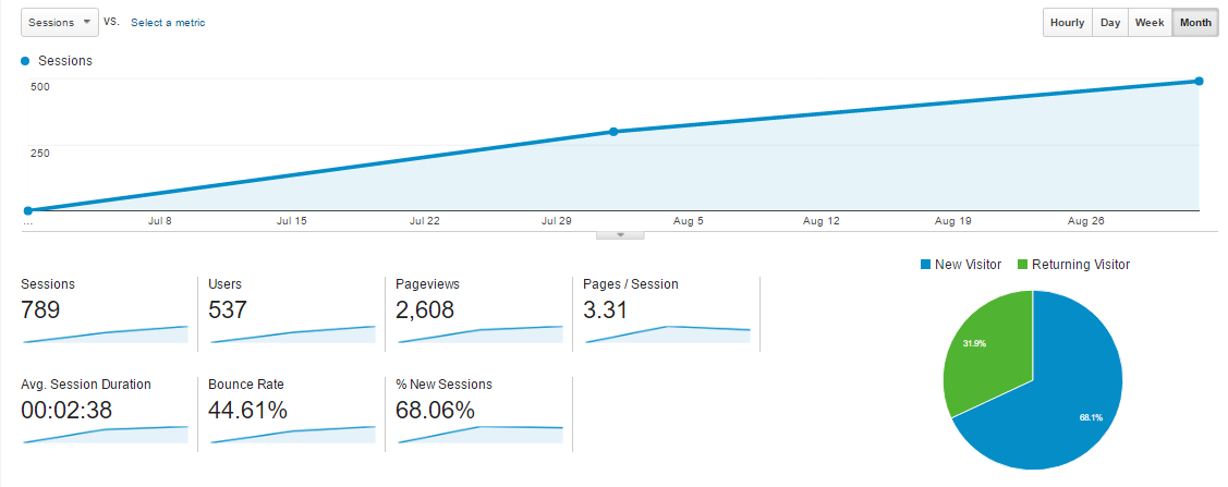
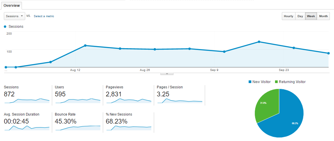
Our Google Analytics account shows that we went from 0 visitors to an average of 16 sessions and 51 pageviews per day. For a new B2B website in a fairly specialized industry, I’m pretty happy with that number. I also see that our bounce rate is below 50%, which means that for every 2 people who visited our site, 1 went to a different page on our website. We’ve gotten a few leads, are proud to direct potential clients to our website, and established our online real estate.
Perhaps the most unexpected success that came from the new website is influx of new talent. We received a number of great applicants, so much that we had to add more questions to our application process to qualify them more competitively.


